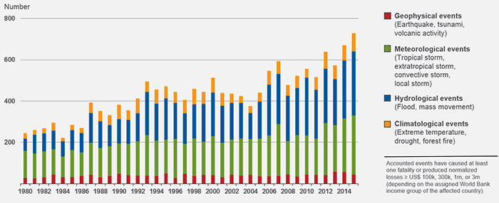
This chart shows that over the past 30 years there has been a steady increase in the number of extreme weather events across the world. These events are all classified as natural catastrophes with the number of events being shown on the y axis. There a four categories of event shown in the key on the right, in the chart you can see that the frequency of each event has increased over the past 30 years. This chart therefore shows clear evidence that our climate is changing into one with more extreme weather conditions.
This chart was sourced from an article about climate change, however it was produced by the NatCatSERVICE(NCS). The NCS is comprised of 37,000 data records, every year 1,000 data records are recorded and analysed each year. Due to the amount of data collected by the NCS and their impartiality, I believe that this chart is a reliable source to use as evidence.
Graph Source; © 2016 Munich Re, Geo Risks Research, NatCatSERVICE.
https://www.munichre.com/en/reinsurance/business/non-life/natcatservice/index.html
 RSS Feed
